Toggle Nav
 Inspire.
Create.
Stitch.
Inspire.
Create.
Stitch.
Inspire.
Create.
Stitch.
Search
Inspire.
Create.
Stitch.
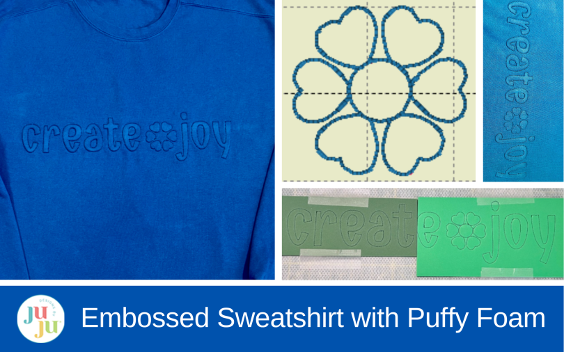
Create a subtle embossed sweatshirt using puffy foam, tone-on-tone thread, and bean stitch applique. This machine embroidery tutorial shows how to add raised lettering under sweatshirt fabric for a soft dimensional look.
I love finding unexpected ways to use embroidery designs, and this project started with an inspiration photo that immediately caught my attention. The sweatshirt had simple tone-on-tone lettering that looked almost embossed into the fabric—subtle, dimensional, and completely different from traditional embroidered apparel. Of course, my next thought was: Could I create that look with my embroidery machine?
After a little experimenting, the answer was yes! By combining puffy foam with a bean stitch applique font, I was able to create raised lettering underneath the sweatshirt fabric instead of stitching the usual applique fabric on top. The finished effect is understated from a distance, but when the light hits it, the lettering really comes to life.
Check out the DBJJ team’s favorite supplies in the Designs by JuJu Amazon store. For stabilizers, batting, and threads, Designs by JuJu+ has everything you need.
Before stitching anything, I wanted to see how the idea might look as a finished sweatshirt. I used ChatGPT to create a quick visual mockup of my concept.
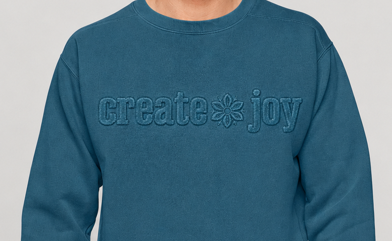
For my version, I used the 2.5" Emmy Doodle Bean Stitch Applique Embroidery Font to make the words create and joy. This font has a running-stitch placement line followed by a bean stitch that normally serves as the applique tack-down and finishing stitch.
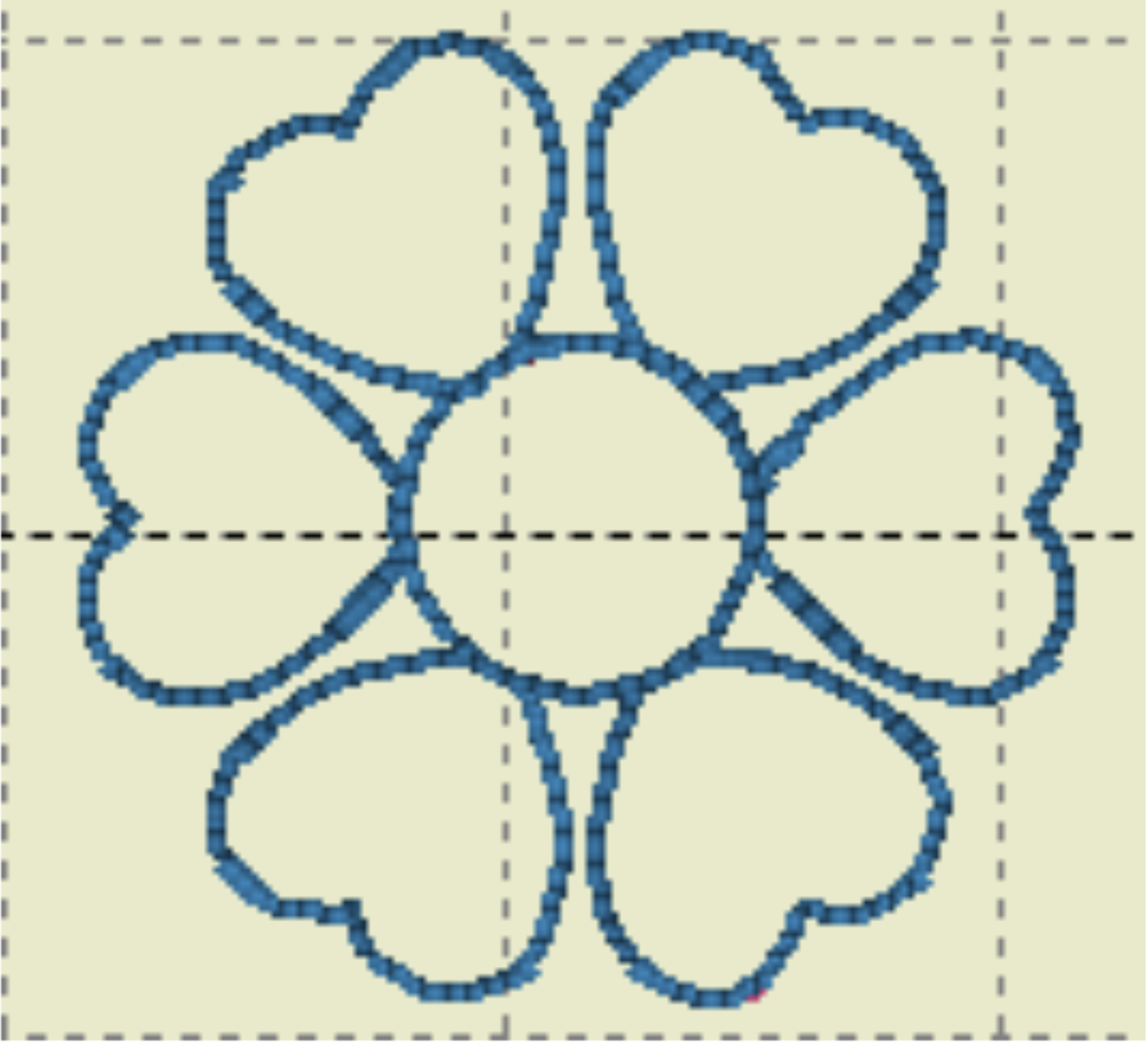
I added a flower between the two words for a little extra interest. I used the 4x4 version of the Heart Flower Applique but skipped the leaves and satin stitches, leaving just the simple flower shape.
The beauty of this technique is that you aren't limited to this exact font or phrase. Any appropriately sized bean stitch applique font could be fun to experiment with, and simple, open shapes are especially well suited to the raised effect.
Normally, a bean stitch applique design would stitch a placement line, add applique fabric on top, and then secure the fabric with the bean stitch.
For this project, I changed the process. I first used the placement and bean stitch lines to create the letter and flower shapes in foam directly on the hooped stabilizer. Then I placed the sweatshirt over those foam shapes and stitched the bean stitch again through the garment.
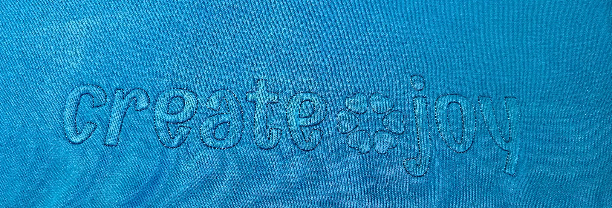
That traps the foam underneath the sweatshirt fabric. Because the thread closely matches the sweatshirt, the stitching recedes visually while the foam creates the dimension and shadow that make the design look embossed.
Arrange your lettering and any additional design elements, either on your machine or in software.
For my sweatshirt, I made the phrase “create joy” using the 2.5" Emmy Doodle Bean Stitch Applique font, then wanted something small between create and joy rather than another letter or punctuation mark. The Heart Flower Applique gave me just the shape I was looking for.
I used the 4x4 version and removed the leaves and satin stitch elements in my embroidery software (you could also just skip those steps on your machine) so the flower could be stitched with the same embossed technique as the lettering.
This is a fun reminder to look at the embroidery designs you already own with fresh eyes. Sometimes one small element from a larger design is exactly what a project needs.
Check the overall width and placement of the final design against your sweatshirt before you begin stitching. A chest design like this one is simple, but careful centering makes a big difference in the finished look.
Hoop no-show mesh stabilizer securely. Load the design and run the first color stop, which should be the placement line.
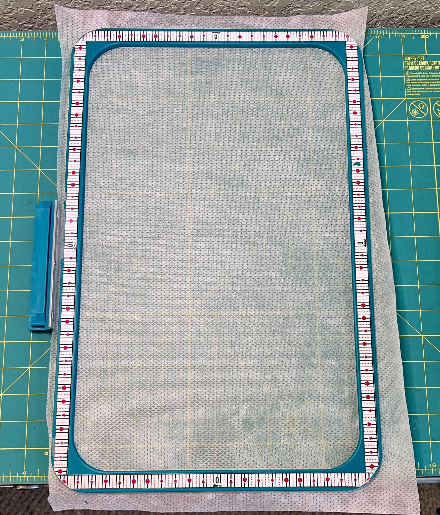
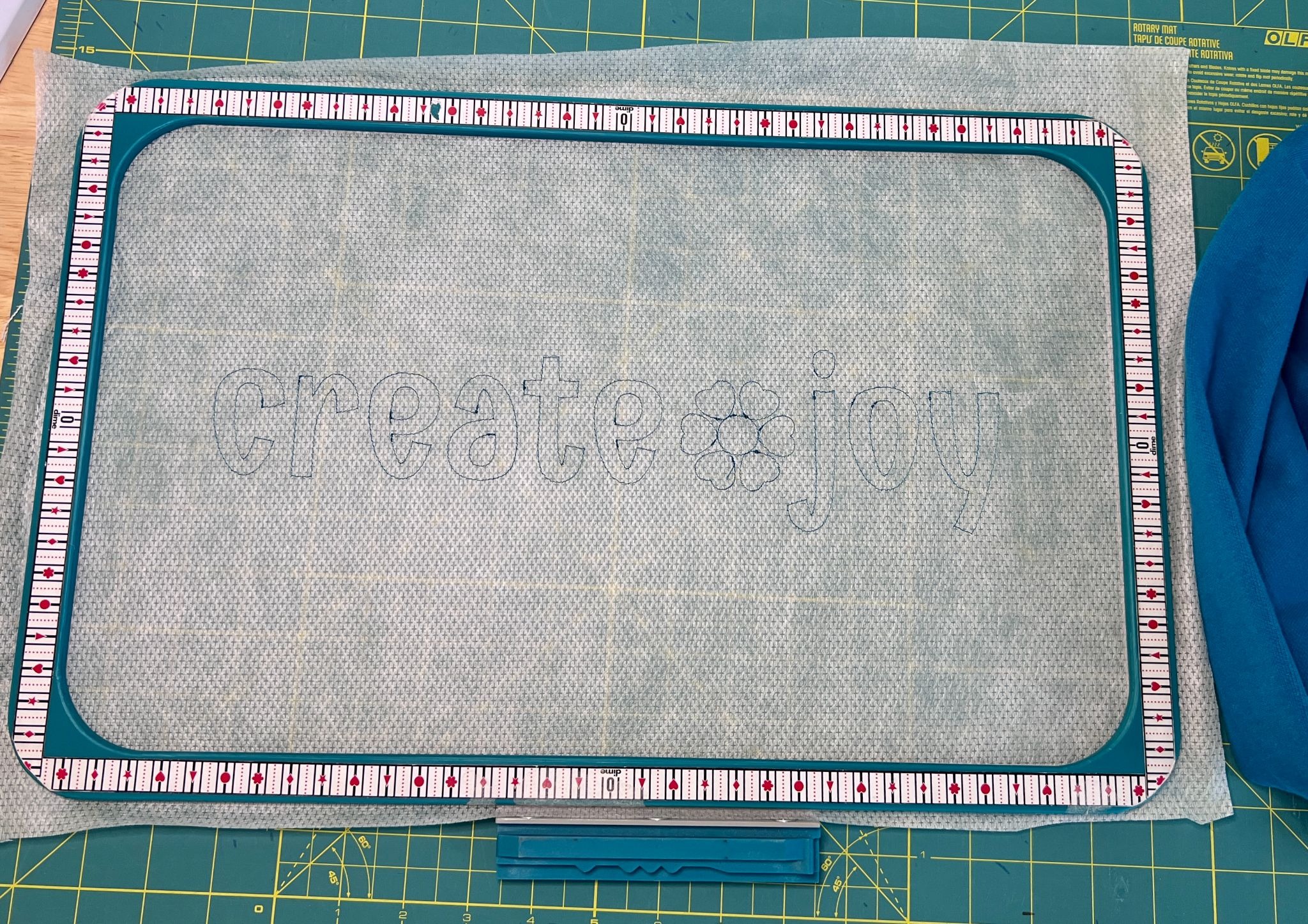
While the placement line was stitching, I measured the sweatshirt to determine my design placement and fused fuseEZ interfacing to the inside of the garment. The interfacing helps control the sweatshirt fabric so it is less likely to stretch or shift during embroidery. Be sure the interfacing extends beyond the entire embroidery area.
Lay the puffy foam over the placement line so it completely covers every letter and design element. I used small pieces of medical tape to hold the foam in place so it wouldn't bounce or shift as the stitching continued.
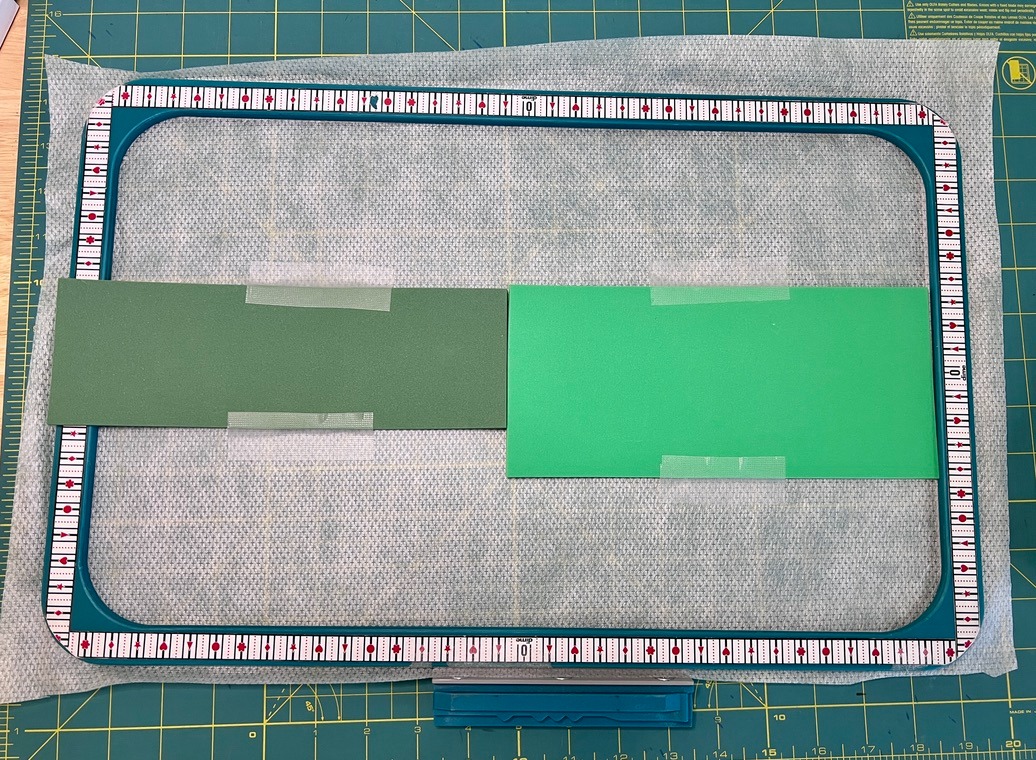
Run the tack-down/bean stitch so the design outline stitches through the foam and stabilizer.
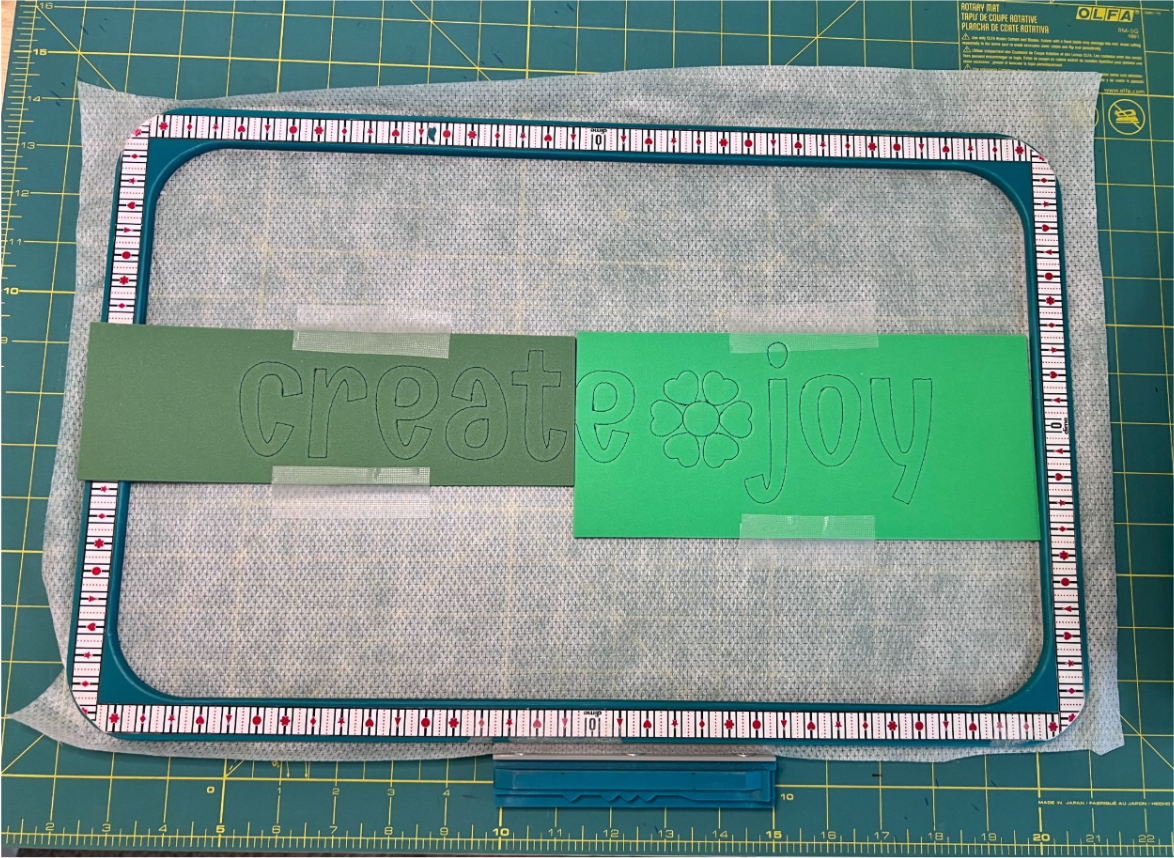
One lesson I learned during this project: The bean stitch tack-down perforated the foam much more effectively than the running-stitch placement line. If your design gives you the option, use the bean stitch/tack-down for this step rather than simply rerunning the placement stitch.
Carefully tear away all of the foam outside the stitched outlines, leaving the foam inside each letter and the flower.
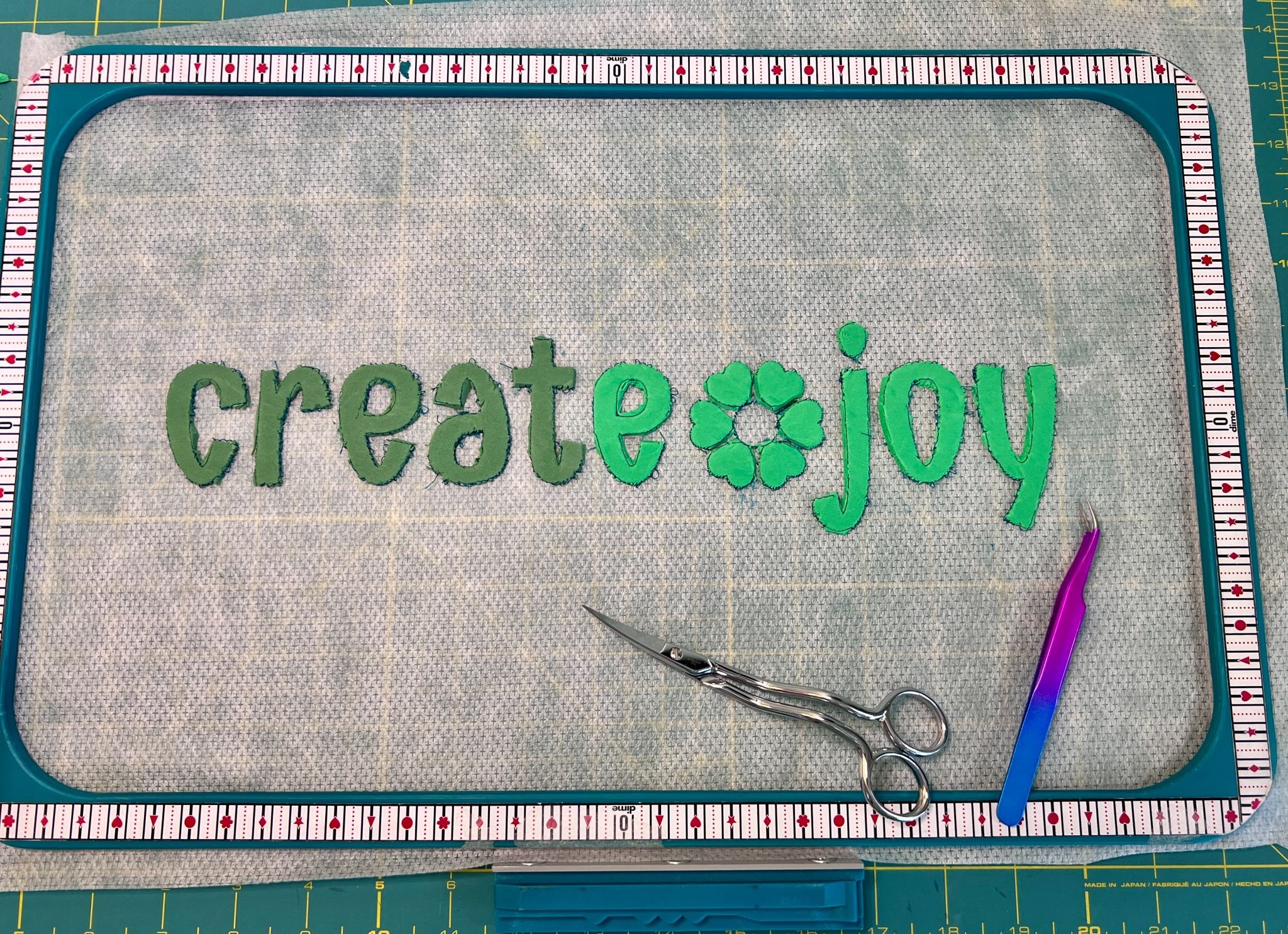
This step was more challenging than I expected because I repeated the placement running stitch to perforate the foam. I should have used the tack-down bean stitch instead. Take your time and work slowly around the curves, narrow areas, and centers of the letters. It may look a little messy at this stage, and that is okay—the sweatshirt will cover the foam, and the finished design looks much cleaner.
Place the sweatshirt over the foam shapes in your planned location. Smooth the garment carefully and make sure the design is centered and straight. I used pins to hold the sweatshirt in place.
Because you are embroidering a finished garment, double-check that the back of the sweatshirt, sleeves, cuffs, seams, and any other loose fabric are completely clear of the embroidery area before stitching.
At this point, the foam should be sandwiched between the hooped stabilizer and the sweatshirt.
Repeat the final bean stitch/tack-down line, this time stitching through the sweatshirt fabric around the foam underneath it.
As the outline stitches, the sweatshirt fabric forms around the foam shapes. Using thread that closely matches the garment keeps the stitches subtle and allows the raised dimension to be the main feature.
Once the embroidery is complete, remove the hoop from the machine and the project from the hoop. From the back, carefully trim away the excess stabilizer and interfacing around the embroidery.
Turn the sweatshirt right side out and smooth the design. The lettering may look subtle when viewed straight on, but the embossed effect becomes much more visible as light and shadow move across the raised shapes.
I really like how subtle this project turned out. From farther away, the sweatshirt looks almost completely tone-on-tone. Up close—or whenever light falls across the letters, the raised design becomes much more noticeable.
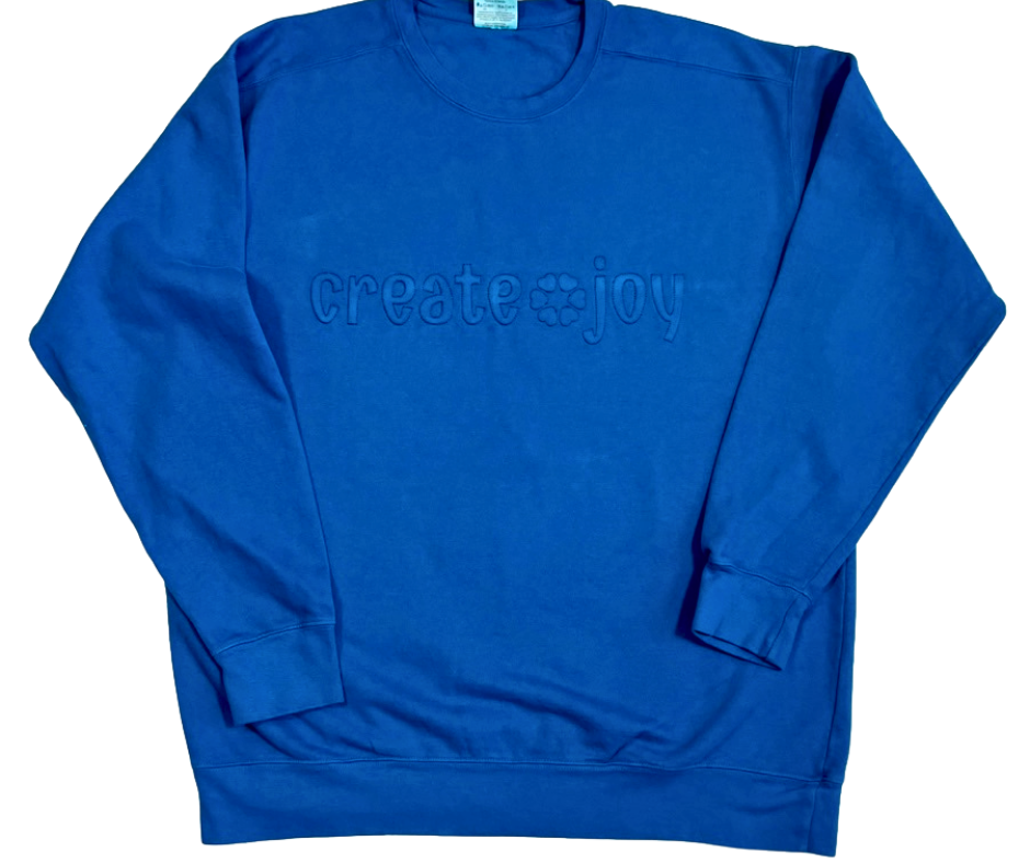
Because this technique relies on the shape of the applique rather than applique fabric, there are so many ways you could make it your own. Try a different phrase, a monogram, a name, a single oversized letter, or another simple bean stitch applique design. You could also experiment with different sweatshirt and thread combinations, from perfectly matched thread for the most subtle look to a slightly contrasting thread if you'd like the stitching itself to show.
This technique is definitely one to test before committing to your favorite sweatshirt. Foam thickness, sweatshirt fabric, stabilizer, and design shapes can all affect the finished result.
My biggest takeaway was that the bean stitch tack-down perforated the foam much better than the running-stitch placement line. Using the bean stitch will make removing excess foam much easier and cleaner.
Most importantly, don't be afraid to experiment. This entire project came from seeing an inspiration photo and wondering whether I could recreate the idea with my embroidery machine.
That's one of my favorite things about machine embroidery: A design doesn't always have to be used exactly the way you first imagined it. Sometimes changing the technique is what creates something entirely new.
Please share what completely-new-to-you projects you dream up in the Designs by JuJu Embroidery Blessings Group on Facebook, or use the hashtag #designsbyjuju anywhere on social media. We’d love to see what you create!
