Toggle Nav
 Inspire.
Create.
Stitch.
Inspire.
Create.
Stitch.
Search
Discover how to choose fabric and thread for applique that pops with personality, plus expert tips and inspiration.
This is Part 2 of our 8-part series, Applique Made Easy. In this installment, we’re exploring how to choose the best fabrics and threads for applique machine embroidery projects to help you create designs that pop with personality. Whether you're brand new to applique or looking to polish your technique, this series is designed to guide you step-by-step through the creative process. Here’s what you can expect from the full series:
Get ready to bring your applique projects to life—because the right mix of fabrics and threads can turn a simple design into a show-stopping, one-of-a-kind masterpiece.
We will walk you through real-world strategies for picking fabrics, choosing threads, and playing with variegated thread magic. I’ll show you some examples using Designs by JuJu’s patterns so you can follow along and add your own touch to the designs.
Applique is where your creativity meets the hoop. Every choice you make from the fabric’s feel to the thread’s color tells a story. If you want your projects to feel more like “you,” here are some tips to get you started.
Check out the DBJJ team’s favorite supplies in the Designs by JuJu Amazon store.
We can use a variety of fabrics in our applique projects. Each fabric brings a unique texture and look to your applique.
Quilting cottons tend to be my favorite to use in applique projects. I probably use them for 90% of my applique. They are versatile, crisp, and smooth in the finished product. They come in a large variety of colors and prints. Flannel is a fabric that adds softness and warmth to designs.
Felt can look bold and have very clean edges. It adds a nice texture to the design and trims very easily with clean edges. Faux leather comes in a few different colors and textures. I like using this to add sheen and texture to the design. Glitter vinyl can add a pop of sparkle and structure to your project.

My favorite place to find fabric for my applique projects is my scrap fabric box. I think we all have one. It’s great to find small pieces of fabric that will fit in the look of what you’re going for. And since it’s a scrap box, some of the fabric might remind you of other projects you have made and add a bit of sentimentality to your embroidery.

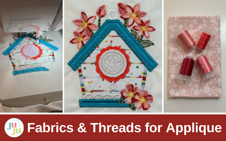
I stitched out a birdhouse with a variety of fabric textures. I used faux leather for the house, a felt for the roof, duck cloth for the door and window openings, a minky for the fluffy bird, glitter vinyl for the flowers, flannel for the bottom of the house, and quilting cotton for the heart and leaves.

Once you’ve gathered your fabric types, the next step is choosing prints that suit the size of each applique piece. Not all patterns are created equal when it comes to scale. This one detail can completely change your final look.
I love red and use it to decorate my house everywhere I can. One of my favorite prints is red with white polka dots.

Just look at how fun they are! But also look at how different they are. The scale of the polka dots ranges from tiny to large. Knowing where to place those in a design is helpful.
I like to use small prints for small details and large prints in large areas or backgrounds. I also don’t like to mix busy fabrics together. I like to find my favorite busy fabric and coordinate it with smaller prints and solids. But that's how I like to do things; you can put fabrics together so that they match your style and feel.
Here I made the same birdhouse with two different red prints. See how that one difference changes the look of the whole design? One seems more fun and playful, and on the other one the butterfly and flowers “pop” more. So choose the look for the spirit you’re going for.

Another thing we should check with our fabric is its value. This isn’t the price tag at the fabric store; it refers to the lightness and darkness of the fabric.
Value isn’t always easy for me to see with my eyes. So I’ve found that taking a picture of my fabric and changing it to grayscale on my phone helps me see if I have too many lights or too many darks in my fabric selection. I try to get a good mix of lights and darks to add contrast to my designs even if they aren’t something that I notice I am seeing.
With these fabrics you can see that the pink ones have a much more dark value and the purple and green have a lighter value.

By adding just one more matching piece of fabric to each group I get a more balanced palette.

But if you want to have a nice pastel palette and the value is all similar, go for it. The applique police are only a myth! It’s your project and you can do what you like.

Included in each of your applique designs is a color chart. Remember the color chart is a suggestion, not a rule book. These are starting points to encourage you. Feel free to make substitutions that fit your fabric and vision. Whether you’re swapping in your favorite brand, choosing threads that match your fabric stash, or tailoring a design to fit a specific theme, trust your instincts! You are the artist.

There are a few different approaches to applique threads. First, we can match our fabrics. This technique uses thread in the same color as the fabric. It creates a smooth, nearly invisible edge so it’s great for heirloom projects, subtle designs, or when you want the fabric to take center stage.

Blending the threads is another option. Here, we will use a thread in a slightly lighter or darker shade than the fabric. It softly defines the edge and enhances dimension without overpowering the fabric.

Contrasting is also a great option. This is your chance to be bold. Use a thread color that stands out against the fabric, like navy on yellow or white on red, for playful, modern, or whimsical styles where the outline becomes a design element of its own. You have a ton of options with this one, so choose the one you like the best.

Here I stitched out three purple flowers and used threads that contrasted on the left, blended in the middle, and matched on the right.

If you want to take your thread choices to the next level, variegated threads can be a fun choice. Variegated thread shifts shades or hues along the strand. They are perfect for adding a hand-dyed, painted look. They often work best with linework, florals, and open fills. When they are used in heavy satin stitched areas, they can sometimes have a striped effect. They are also not always desirable to be used in precision-based designs like faces or lettering as they are a little busy for those stitches. It’s always a good idea to test the variegated threads on a scrap first to preview how the gradient effect will look in your design.

There are other specialty threads you can use, such as metallic, UV changing, and glow in the dark. I usually use these sparingly in a design to add a fun little pop. In my experience, the secret to getting metallic threads to work great is slowing my machine down and stitching slowly. Use whatever you want to make your design feel like you.

Here are those same purple flowers stitched with variegated and metallic threads. The variegated stripes look playful on the edges of the flowers. The variegated line on the bumblebee’s path draws your eye and adds motion to the design. The leaves didn’t stitch out quite like I wanted them to, but they lend an air of whimsy too. The metallic thread in the center of the flowers catches your eye and adds sparkle to the design.

Once I’m ready to start my project, I often find that making a little “mood board” on my cutting mat helps pull everything together. Think of the intended recipient and what you want the feel of the project to be. I print off the color chart and start selecting my fabrics.

Add in fabrics you want to use. Make sure you’re mixing and matching the textures, scale, and value for the design you want. Remember what your theme is: Is it playful, coordinated, funky, or classic? Choose your fabrics to match. Since my other examples have been more classic and matching, I thought this time we would have a bit more fun by adding in a bright blue and a sparkle vinyl.

Then choose your threads. Do you want to blend, coordinate, or contrast? Or maybe a little bit of each depending on the design element you have in the pattern. I chose some solids that match, some variegated to flow for the botanical elements, and a contrasting thread for the door.

Now that we have things ready to go, it's time to start stitching. Stitch your placement stitches, cover with fabric, stitch the tack-down, and trim the fabrics.

Then we will add the finishing details.

Now you have an applique piece that shows your personality and is uniquely yours!

At the end of the stitching day there really is no “right” way to applique, only your way. These tips are here to guide and inspire, but the magic happens when you trust your style. Be bold. Be playful. Be you. Make each project a reflection of you.

I want to see how you’re mixing and matching fabrics, threads, and designs, so please share your projects in the Designs by JuJu Embroidery Blessings Facebook Group, or anywhere on social media using the hashtag #designsbyjuju. We love to see what you create!
Remember to check out the next post in the Applique Made Easy series: “Applique the JuJu Way: A Step-by-Step Tutorial”, available on August 21, 2025.