Toggle Nav
 Inspire.
Create.
Stitch.
Inspire.
Create.
Stitch.
Search
Choosing the right embroidery font transforms your design. Explore tips to find the best fit for your fabric and style.
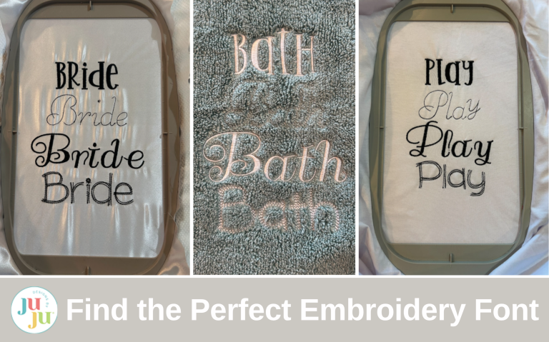
Have you seen all the fonts on Designs by JuJu’s website? There are so many, and every month when they release more I want to have them all! But sometimes when it comes time to use the fonts in a project, it can be a little overwhelming. Today I’ll walk you through some pointers to help you choose the best font to fit not only the fabric in your project but also the aesthetic you’re looking for. I’ll showcase some of the font options, but there are so many more available on the website. Be sure you check them all out!
Let’s begin by defining some of the terms that you see while choosing a font on the Designs by JuJu website. If you look under Embroidery Fonts, you’ll see the Script, Serif, Non Serif, Unicase, Scribble, Sketch, Bean Stitch, Two-Color Fonts, Seasonal Themed Fonts, Varsity, and Greek fonts.

I think of script fonts as cursive or calligraphy fonts. The letters can connect and have a handwritten look to them. You can find ones that look playful or sophisticated. Vera Script is a good representation of this group of fonts.

We also have serif fonts. Serif fonts have a small decorative stroke, or serif, on the letters. These tend to look a little more formal to me, but we can find playful ones too. Speed Zone Embroidery Font is a good example of letters with serifs.

Non serif fonts are more basic, and are sometimes called “sans serif.” They don’t have the decorative strokes that a serif font has and offer a cleaner, simpler feel. I think they have a more casual look, but you can find ones that will fit any project you have. Grover Embroidery Font is a great non serif font.

Unicase fonts are all one case, either upper like the Jewels Embroidery Font:

or all lower case like the June Apple Embroidery Font.

And even though all the letters are capitals in the Applesauce Embroidery Font, the uppercase letters are larger (called caps) and the lowercase letters are smaller (called small caps).

Scribble fonts are fun. They have a few lines of stitching to make each letter. Check out Happy Giraffe Scribble Embroidery Font as an example.

Sketch fonts are filled fonts with sketch stitches. Family Time Sketch Embroidery Font illustrates this style.

Bean stitch fonts can be an applique font that is finished with a bean stitch like the Daisy Doodle Bean Stitch Applique Alphabet.

Or they are a whole font that is done in bean stitches like Vintage Script Font.

Two-color fonts are pretty self-explanatory. They are stitched out in two colors. Whiz Kid Embroidery Font shows this style.

Seasonal fonts add a little bit of holiday magic to the alphabet. Check out Halloween Monogram Embroidery Font.

Varsity fonts are good for sports teams and have that sporty feel. These also come in a lot of applique styles. Collegiate Embroidery Font is perfect for a jersey or jacket.

The Greek fonts are applique fonts that are symbols. Greek Athletic Applique Alphabet is perfect for rush week!

Fonts create a mood. Some fonts are playful and fun and make you happy. Some are more serious, businesslike, and professional. And others are classy, sophisticated, and elegant. If I’m making an embroidered blanket for a wedding, I’ll probably choose an elegant font. If I’m choosing something for a baby, I’ll find a font that I think is playful and fun. Here are some of my favorites for each category.
For some fun fonts, check out Anonymous Embroidery Font, I2S Jelly Bean Embroidery Font, and Sweet and Silly Embroidery Font.

Orleans Embroidery Font, Aristocrat Embroidery Font, and Amethyst Script Embroidery Font are some of my go-to fonts for elegance and sophistication.

These professional looking fonts are great for a straightforward look: Puma Embroidery Font, Buttercream Embroidery Font, and Grade School Embroidery Font. I like to use these in baby announcements to fill in the data.

There are so many fonts to choose from and each one has its own vibe. I love collecting all the fonts so I have them on hand whenever a particular mood hits me.
We also need to take the item we are embroidering on into consideration. If we are embroidering on a towel or fleece blanket, a chunky block font or wide satin stitch font works well. We need something that will stand out above the fabric’s loops and textures. Remember to use a clear topper with these projects to help keep the stitching from sinking into the fabric’s texture. Check out Willow Tree Embroidery Font, Penelope Embroidery Font, and Second Breakfast Embroidery Font.

If you are working on apparel and items like T-shirts, soft, scripty fonts and handwritten fonts look amazing. They add a personalized touch while still being easy to read. Check out Yours Truly Alphabet Embroidery Font, Graceful Chain Stitch Embroidery Font, and What a Time Embroidery Font.

Quilts, pillows, and home decor are the perfect canvas for fonts that show off your creativity and design style. If visibility matters, large fonts with open spaces can have a great visual impact. Check out Farmhouse Lemonade Embroidery Font, Danielle Embroidery Font, and Soft Serve Embroidery Font.

For kids’ items and clothing, a font with some thickness to it will hold up better to multiple washings. Playful, rounded fonts add a bit of whimsy to your project. Check out Guys My Age Embroidery Font, Emery Embroidery Font, and Pajama Jam Embroidery Font.

Now I’ll show you some real world examples using the Coconut Meringue Embroidery Font, Leona Run Embroidery Font, Samantha Script Embroidery Font, and Cinnamon Cake Scribble Font. I’ll stitch each on a towel, fleece, satin, and a T-shirt. Then we can take a look at the results.

I’ll start with a bath towel. I’m going to be using the 1.5” size of each of the fonts so we can see how it stitches out. I’m using tearEZ Tear-Away Stabilizer and a water-soluble topper. I floated the towel and secured it with a basting box.

After the four fonts stitched out, they looked very nice on the towel.

But when I unhoop the towel and remove the stabilizer and topper, we can see how the thin Leona Run Font disappeared, and even the serifs on Samantha Script sunk into the furry texture of the towel. So on a towel, a thicker font really does show up and pop better.

Next, we are trying these fonts on a piece of fleece. I hooped and secured it the same way as the towel. They also stitched out great.

After removing the topper and stabilizer, the differences aren’t as dramatic as on the towel. We can at least still read all the words, but you can still see how the narrow Leona Run disappears into the fabric. Coconut Meringue and Samantha Script really pop on the fleece.

Next, I used a delicate satin fabric. I hooped it with some magicMESH Cut-Away Stabilizer and stitched the fonts out. We can already see some puckering while the fabric is still in the hoop.

When I unhooped the project and trimmed the stabilizer, we see exactly how the delicate satin fabric handled the fonts. We definitely have some wrinkles around the fonts.

As I looked closer I could tell that the Leona Run Font looks wrinkled but it’s mostly because of the other fonts. So I stitched it out alone.

After it is out of the hoop and the stabilizer is removed, we see how nicely the Leona Run Font stitches out on satin with no wrinkles.

Last, I used a T-shirt with some magicMESH Cut-Away Stabilizer and stitched out the four fonts.

Then I unhooped the T-shirt and trimmed around the stabilizer.

Here’s a closer view of the Coconut Meringue and Leona Run fonts. You can see how in between the letters of the Coconut Meringue there is a bit of pull, but the thinner Leona Run font doesn’t have any stretching.
If there is any doubt in your mind about your font choice, I encourage you to stitch out a test run to see how it will work with your chosen fabric.

I hope this has helped you have the confidence to choose a font that fits your project's theme and feel. Remember, there aren’t any font police and you can stitch whatever makes your heart happy.
I’d love to see what you’re making, so post your projects in the Designs by Juju Embroidery Blessings Facebook group or anywhere on social media using the hashtag #designsbyjuju and let us all celebrate your creations!